Beomsik Won
ArchiScultpture

Photographer analysis
Visual qualities:
The shot is an architectural collage of different buildings. This type of work is known as 'ArchiSculpture' and explores the relationship between architecture and sculpture.
There is a mix of period and modern architecture - from an office block, Starbucks shop front and industrial warehouse to gothic and regency style townhouses and a classical dome. There's also a potted shrub perched precariously out on a limb.
I think that the collection of photos used have been cut-out from their original compositions using a digital editing tool and then reconstructed digitally into a new fantastical and surrealist form.
Composition and formal elements:
Angles have been used effectively near the top of the structure to give it perspective and a more three-dimensional feel. The shots making up the rest of the structure have been taken front on, which on their own would make it seem flat and two-dimensional.
The background has been kept deliberately minimalist and there is lots of negative space surrounding the main image. This helps to draw the viewer's eye towards the main subject matter of the image and gives the structure a more dramatic presence against the skyline. The low-level buildings in the background serve to give the ArchiSculpture scale.
The use of shape is one of the main elements in the photograph. There are regular and irregular shapes, which are mainly rectangles with some triangles. The variations in tone and materials that the individual buildings are constructed from help to give the image textural form. The use of black and white also gives the image a more dramatic tone.
Camera settings:
I think the photographer probably used an automatic shutter speed because there is no movement in the image, so there is no need to use a quick shutter speed to freeze action in the shot. The fact that most of the images are sharp and without blur also suggests that a slow shutter speed wasn't used either.
As the individual shots making up the ArchiSculpture have a slightly sharper focus than the buildings in the background, I think that the photographer used a shallow depth of field.
Personal Reflections:
I really like the surreal quality of this and other works of Beomsik Won. It has been created with careful precision and I'm amazed by how well the different images fit together.
Ideas and inspirations:
This picture inspired me to create my own unique ArchiSculpture. I decided to take photos of London landmarks and British design icons, cut them out and reassemble them digitally.
Beomsik Won characteristically tends to position his collages against a very minimalist background, to ensure that his ArchiSculptures are the main focus of attention in the shot. I liked the idea of placing my ArchiSculpture in a more incongruous location, such as a beach, as it would add to surrealism of the piece. However, I made the decision to keep my background minimalist, so that it would not compete with the main subject matter.
Process for creating my ArchiSculpture collage
Background setup

After importing the background beach image into Photoshop, I then converted it to black and white using the Image adjustment tool.
Then I dragged the background image into a blank A4 document and selected the crop tool and pressed control X to change the orientation of the image from landscape to portrait.
To create a more dramatic and intense sky, I decided to make the clouds larger and positioned them more in the centre of the background image. To achieve this, I utilised the Transformation / Scale / Lock aspect ratio enlarging the image by +25 and centralised the clouds by using the left and right arrows on the keyboard.
Importing edited images and resizing
After initially cutting out the original photographs in PixIr using the lasso tool, I saved them as transparent PNG black and white images and imported them into Photoshop.
Next, I resized each image using the Edit / Adjustment / Scale by dragging the frame in towards the centre of the image to size it appropriately by eye. Then I arranged the layers of the different images around the centre line in the document, positioning them to reflect the sequences in the original hand drawn plan.


Additional editing of images
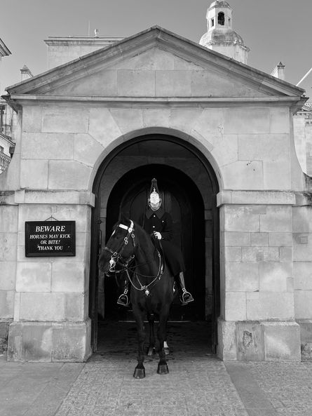
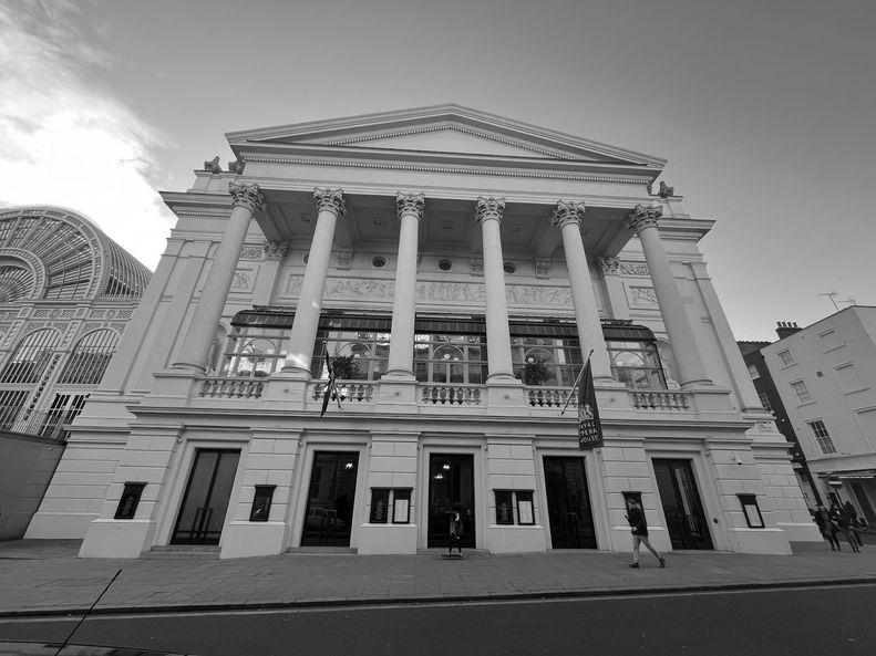
I then further refined the outer the edges of several of the images using the pen tool in Photoshop, by creating anchor points and then deleting the superfluous sections. This involved cropping the outer walls of the Royal Opera House, edges of the Horse Guards building and the top of the phone box, then using the eraser tool to remove small imperfections.
Next, I resized each image using the Edit / Adjustment / Scale by dragging the frame in towards the centre of the image to size it appropriately by eye.
Then I arranged the layers of the different images around the centre line in the document, positioning them to reflect the sequences in the original hand drawn plan.
Shadows and highlights on St Paul’s, Horse Guard, Portico and Opera House
Using the Image / Adjustments / Brightness & Contrast tool, I increased brightness on the St Paul’s image by 8% and the contrast by 40% and the Opera House brightness by 26% and contrast by 14%. As the mounted soldier in the Horse Guards image was particularly dark, I utilised the Image / Adjustments / Shadows & Highlights tool to increase the highlights by +20, which made the soldier standout more clearly.
Adjusting the perspective on the Royal Opera House
After moving the images into place to assemble my collage, I noticed that the perspective on the Royal Opera House image was leaning backwards and did not look balanced on the composition. So I used the Edit / Transform / Distort function to create a more upright and balanced image of the Opera House.
I added gridlines to create guardrails to adjust the image against. I then used the handles to stretch the image left and right and top and bottom to better align the image perspective. I created two duplicate layers of the image to enable me to experiment with the technique and compare different results to find the one I was most satisfied with.
Editing of phone box
I flipped the original phone box image horizontally using Edit / Transform / Flip horizontal to create the phone box for the RH side of the Opera House, to give it the correct orientation. I then noticed that the phone box signage was back to front. So I copied phone box 1 to create a duplicate and then cropped the text out using the Rectangular Marquee Tool and overlaid this onto phone box 2. I then merged the layers to join the new signage and the phone box image using the Merge Down function.
Final image

I am really pleased with my finished collage and the editing skills I have developed both in Pixlr and Photoshop. I would like to explore the concept of ArchiSculpture collage further and experiment with three-dimensional architecture and the use of colour to create more surrealist compositions.
I think my final image would have been even better if I had used a background shot that looked more clearly like a beach, either showing the sea in the distance or the ripples left in the sand when the tide has completely gone out.
Conclusion

Beomsik Won - Creative Landscapes Project
Composition and editing
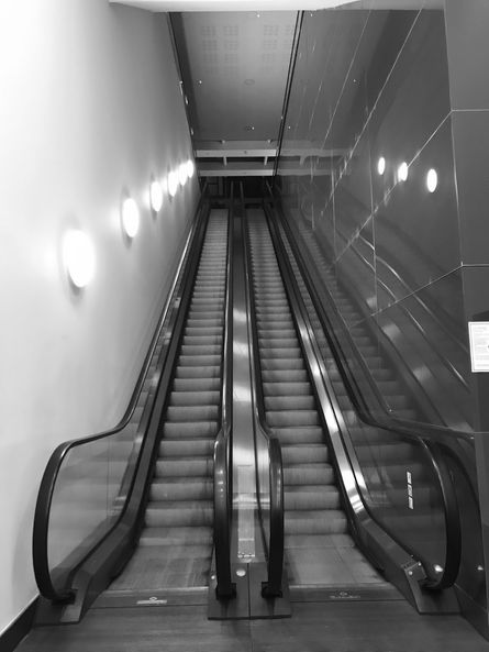
I created my Beomsik Won inspired photographic composition in response to the title of ‘Creative Landscapes.’ I shot a selection of photos of well-known London landmarks and from these chose images that I felt would work together in a collage. These included: St Paul’s Cathedral, the Royal Opera House, BFI Imax Cinema, a mounted soldier of the Queen’s Guards outside Horse Guards building in Whitehall, together with the image of an iconic red telephone box and an escalator.
In my composition, I was aiming to achieve a mix of classical and modern architecture and the juxtaposition of urban architecture within a rural landscape. I selected a beach image that I took on a recent holiday in Scotland, as I felt it would provide a dramatic and surreal backdrop for my ArchiSculpture collage. I also selected the image of an escalator to help create the sense of the composition being balanced precariously on a pedestal.
I produced a sketch to illustrate how my different edited photos would fit together and to get a sense of the required size and scale of each image.


